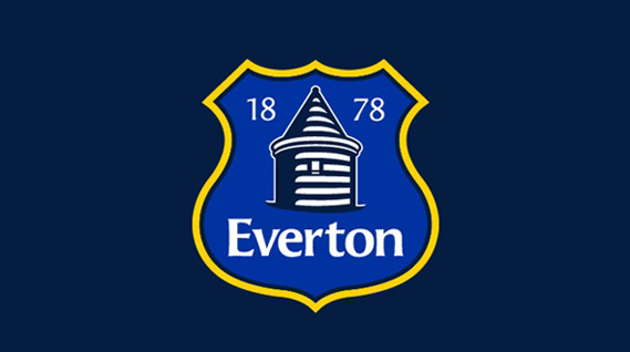
One of the hardest briefs a designer is ever likely to get is the rebranding of a football club’s crest. Supporters feel particularly attached to traditional visual elements of their team’s identity, and rare is the new version of a club’s crest which meets the satisfaction of those in the stands.
Even rarer, however, is the instance when the redesign attracts such ire that it has to be abandoned, but that’s what happened this week when Everton F.C. launched their new crest. Though they claimed it had been developed in consultation with fans, judging by many fans’ responses very few of them felt they had been consulted. The removal of the club’s Latin motto and the general simplification of the design (similar to that undergone at Arsenal a few years ago, who also had a crest that was quite tricky for manufacturers to reproduce) were the main problems supporters had, and a petition attracted so many signatures that Everton were forced to publish an apology on their website.
Yet is the crest really that bad? Creative Review took a look at it against the history of the crest’s design, and concluded that the petition was ‘bad news for design’. However, the extended comments thread beneath indicates that interest in design remains high…

The Monitors


Follow us
Follow us on Facebook Follow us on Twitter Follow us on Google+ Subscribe our newsletter Add us to your feeds